Sunday, November 25, 2012

Lab 8

Lab 8 Census 2000/2010

The first map I created is called Percent Asian Population. From the map, we can see that the majority Asian people are concentrated in the West Coast of United States, especially California. There is a relative higher percentage of Asian population in the East Coast cities, like New York. Recently, as more Asian immigrants started to move into cities like Chicago, Washington D.C., Boston and Atlanta.


The second map is called the Percent Black Population. The map clearly shows that the Black people primarily live in South East part of the US. Most live in States, such as mississippi, Alabama, Georgia, North and South Carolina and Tennessee. A few live in Southern California and Washington as well. The legacy of South America is a significant factor of Black demography.


The last one is the map of Percent of other race alone. The State of California  Arizona, Texas and New Mexico have the highest percentage of different races in the US. And those places are along the coastal line. The North Eastern part of the US. are still dominated by White population. Overall, the majority of immigrants are Asians, Latinos and Blacks.

I was surprised about how ArcGIS can create maps based for different purposes. Through graphic depiction of U.S. Census data, people and government can better share the information provided by the maps. The census map not only tells us how the races are distributed, but it also interconnects with American history. Immigration and Civilization all contribute to current census demography. Asian people concentrate in the East and West coasts, and black people are more gathered in the South. Before doing the tutorial, I was totally lost about how to finish the assignment, because we have to use selected population data. But after carefully following the instruction and using all the techniques I have learned from previous labs, I eventually figured out how to do the lab and finished it really quickly. The skill of creating maps is really helpful and everyone can benefit from it.

Geography 7 informed me a lot about Geographic Information Systems. Although it may be challenging at the beginning, but it is definitely rewarding to learn the skill of creating maps. This sill allows me to design massive programs, different types of maps and inputting various databases. Sometimes when I am confused about the lectures, I was able to have a better understanding after the weekly discussion, because I had opportunities to learn GIS by hand on hand operations. Before taking this class, I thought map creators are geniuses, because the map creating process seems like a rocket project to me. But after 8 labs, I found myself to be a genius since I learned the skill of creating maps for my own preferences. I really appreciate this class and GIS because it not only taught me more geographic knowledge but it also allowed me to generate maps with various databases.

Wednesday, November 14, 2012

Lab 7


Top: 39.383
Bottom: 39.336
Left: -123.691
Right: -123.784
Spatial Reference: Coordinate System GCS North American 1983
Angular Unit: Degree (0.017453292519943295)

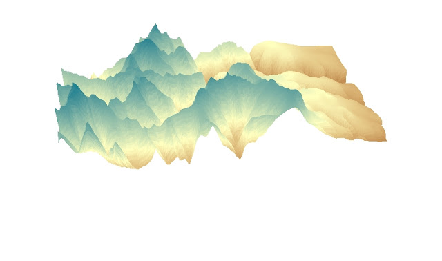
The area I selected was the portion of Santa Monica Mountains, California. I chose this area because it has phenomenal elevation differences.The map is projected from three different perspectives, including aspect, slope and area. Also, I think the 3D projection presents the most visual concept of how the elevation of the mountain is. The four images give us a complete idea of how Santa Monica Mountains look like.

Sunday, November 11, 2012

Lab 6


GCS distance from Washington D.C. to Kalbu: 7835.028179 Miles
Mercator distance from Washington D.C. to Kalbu: Length: 10,112.118968 Miles.
The characteristic of conformal map projection is to preserve angles, so it distorts the area and distance on the map. The pitfall of this type of map projection is that it distorts the actual shape and area of countries. For example, the World Hotine completely alter the shape of the normal map we usually see. But the angles demonstrated are precise and accurate. In my opinion, this type of map projection is the most confusing and misleading one.
World Eckert IV distance from Washington D.C. to Kalbu:7,835.028179 Miles.
World Cylindrical Equal Area distance from Washington D.C. to Kalbu: 10,108.051114 Miles.
Although these two are all equal area projections, but the outcome of the features are different. The World Eckert IV projection distorts the features around the North and South poles. It is more of a spherical projection rather than a flat one (World Cylindrical Equal Area projection). While both of them preserve the actual area, the shape, distance and angles are distorted. Such map projection is often used for big area like the entire world, and mainly focuses on the areas around the equator. A potential of this type of map projection is that its contents are always accurate.
World Azimuthal Distance from Washington D.C. to Kalbu: 8,426.406105 Miles.
World Equidistant Cylindrical distance from Washington D.C. to Kalbu: 5,061.578567 Miles
Equal distance map projection preserves the distance between reference points, and it is best used for small areas like cities. Thus the projection and estimation can be more accurate. Also it is commonly used by small countries.
In Azimuthal equidistant map projection, all distances measured from the center of the map along any longitudinal line are accurate, but the distances and directions to all places are true only from the center point of projection. Distance measurements are accurate between points. And other distances are distorted and thus incorrect. Distortion of areas and shapes increases with distance from the center point.

From this experiment of map projection, I learned different types of map presentations. Some of them preserve area and distance, and others preserve angles. Each map projection has distortion, thus some countries look different from the ones on normal maps. To illustrate the difference, this tutorial selected Washington D.C. and Kalbu as reference points. On different types of map projections, the distance measured also vary. Different map projections serve different purposes, including political, private and business expectations. The size of the selected area is also crucial when determining which map projection needs to be used. All in all, ArcGIS is a really helpful tool.

Saturday, November 3, 2012

Lab 4


Potentials and pitfalls:

Unlike maps and neogeograhy, GIS is effective to organize and convey complex data. There are two different views in ArcGIS, layout and data view, which allow users to edit maps based on their desire in an organized way. By checking or unchecking the icon, layers can be shown and hidden. And layers are helpful in displays and presentations, because they demonstrate different purposes of the same location. For me, the tutorial is completely new to me, as I have never used ArcGIS before.

GIS is a great tool for the public and the government. By simply clicking and importing data, people can easily see the geographic distribution and their spatial information. For example, the information of land use is influential when the government is deciding where to build the airport. Functions like this significantly help us in our environmental impact assessment. Moreover, GIS has a great potential of creating or editing points, lines or arcs on a map. This way, the information on the map will be constantly renewed and won’t be outdated. In this case, governmental officials realize hot a proposed airport expansion would affect the area.

Nevertheless, there are pitfalls in GIS as well. The entire process of GIS tutorial is complicated and I am sure that, without several times of practices, only a few are able to memorize the entire system creation process. Also, it is easy to loose track of my storage information. Once a point is missed or messed up, it is most likely the entire work is vanished. GIS is not a user-friendly software. The tutorial started pretty easy to follow, but gradually became confusing so that I had to figure out on my own.

In addition, misinformation is also a great pitfall. Anyone who has the access to my storage in the computer lab can change anything on what is been saved. And if I want to email it to my mailbox, it takes too much space and will easily loose inputs. Despite all these pitfalls, I certainly enjoyed the GIS tutorial. This is a new technique and will definitely be helpful in the future.