Saturday, October 20, 2012

Lab 3


View Fascinating life in Naperville in a larger map


The map I made for this lab is based on my life experience in Naperville, Chicago. I want to show others the most frequent places I used to go to when I lived there, and for those who are planning to stay there, I hope this could help.

Neogeography literally means new geography. It is a set of practices that allow amateurs to create their own maps based on their spatial values without professional geographic knowledge. The Google map for this assignment is a great example of neogeography. Since inexperienced geographer makes neogeography, there are several pitfalls. First, the information may not be comprehensive or efficient enough for the people that use the map, because the information contained in the map is what the creator values the most, instead of what viewers expect. Second, unlike professional GIS, the information of neogeography can be inaccurate or unreliable. Imagine you are using a map that is created by a random passenger! Anyone can make a map by using existing toolsets. There is no satellite or other supporting techniques to backup the accuracy of neogeography, thus people should question neogeography’s reliability.

However, one great thing I find about neogeography is that you have the chance to create a map that satisfies you own needs. For instance, would you want to stare at a map of Los Angeles, which contains almost every detail that you don’t care about, just to find a good restaurant? No. This is why you can create a map that presents all the good restaurants you have been to and this map can efficiently help other people that have the same purpose of using a map.

There are positive and negative consequences of neogeography. The good side is that everyone has the opportunity to create their own desired maps. Data and information can be accessed easily through media and websites. However, bias and inaccuracy are the bad side of neogeography. People need to be careful when making maps or using neogeography.

Sunday, October 14, 2012

Lab 2

Lab 2 - 7.5 minute map questions

1. The name of the quadrangle is Beverly Hills, CA.
2. The adjoining quadrangles are Canoga Park, Van Nuys, Burbank, Topanga, Holliwood, Venice and Inglewood.
3. The quadrangle was first created in 1966.
4.  Planimetery derived from imagery taken 1978 and other sources. Photoinspected using imagery taken 1995. PLSS and survey control curent as of 1966. Boundaries, other than corporate, verified 1998. Selected hydrographic data compiled from NOS/NOAA chart 18744 (1964).The datum used to create the map was the  national geodetic vertical datum of 1927 (NAD 27), 1929 (NAD 29) and 1983 (NAD 83).
5. The scale of the map is 1:24,000.
6. a) 5 cm on the map is equivalent to 1199.6928 m on the ground.
    b) 5 inches on the map is equivalent to 1.89 miles on the ground.
    c) One mile on the ground is equivalent to 2.64 inches on the map.
    d) Three kilometers on the ground is equivalent to 12.499 cm on the map.
7. The contour interval is 20 feet.
8.  a) The Public Affairs Building: longitude is 11826’30’’W (decimal degrees: 118.441667⁰W)  and latitude is 34⁰04’30’’N ( decimal degree: 34.075⁰N). 
      b) The tip of Santa Monica pier: longitude 118°29'55W (DD: 118.498889⁰W) and latitude 34°00'30N (DD: 34.008056⁰N)  
      c) The tip of the Upper Franklin Canyon Reservoir: longitude: 11824'35''W (DD:118.409722), latitude: 3407'10''N (DD: 34.119444)
9. a) Greystone Mansion: 550 feet or 167.68 meters.
    b) Woodlawn Cemetery: 140 feet or 42.67 meters.
    c) Crestwood Hills Park: 700 feet or 213.4 meters.
10)  The UTM zone is Zone 11.
11) 3763000N and 3615000W
12) 1,000,000 square meters
13)


14) The magnetic declination of the map is 14⁰to East.
15) The water in the intermittent stream between the 405 freeway and Stone Canyon reservoir flows from North to South.
16)

Tuesday, October 2, 2012

Lab 1

Fascinating Mapping!

 
  • Since there were several earthquakes for the past few weeks, I decided to find the map that illustrates potentially dangerous earthquake zones in the United States. The source of this map is http://www.neighborhoodlink.com/article/Community/Earthquakes, and it is a community website called Neighborhood Link. This map depicts where the earthquakes occurred and rated their damage scales with different intensities of black color. From the map, we can see that Los Angeles, the area on the very west side of California, has a high potential of experiencing earthquakes, and the intensity is likely to be comparatively higher than other states. Also, the Northwest corner of the United States and the central area, where Illinois, Kentucky, Tennessee, Arizona and Missouri intersect, are other earthquake hazard areas. I find this map interesting because it is presented in black and white color, which warns people that earthquakes are catastrophic and remind us to stay alert. Most importantly, people anticipated that 2012 will be the last year before the death of the earth due to natural disasters. So I think it would be a good idea to "stay alert" about which states are relatively dangerous in the US.


U.S.A. Places Map


City
People (apx.) in 2008 Source:
Times Square – New York, New York                                         37.6 million
Las Vegas Boulevard – Las Vegas, Nevada                                 30 million
National Mall – Washington, D.C.                                               25 million
Faneuil Hall Marketplace – Boston, Mass.                                  20 million
Disney World’s Magic Kingdom – Orlando, Fl.                          17 million
Disney Land – Anaheim, California                                            14.9 million
Fisherman’s Wharf – San Francisco, California                          14.1 million
Niagara Falls – Niagara Falls, New York                                    12 million
Great Smoky Mtn. National Park – Tenn., N.C.                          9 million
Navy Pier – Chicago, Illinois                                                       8.2 million
  • For those excited travelers, here is a map that shows you the most visited places in the United States. Time Squares, which is located in New York city, is the most visited place. The second place belongs to Las Vegas Boulevard that is located in Nevada state, and the third one is the National Mall in the Washington, D.C. As you may realize, the most visited places concentrate in popular cities, including New York, San Francisco and Chicago. Therefore, do not hesitate whenever you are planning to take travel around the United States. For more information, please visit the source origin: http://mrnussbaum.com/pdfs/places.pdf. I assume the publisher of this map is Mr. Nussbaum, and no other publication information is provided. I find this map interesting because I love traveling and having the  knowledge about where popular areas are is always a good start of the trip. But I wonder why the central areas are not as popular as the coast cities?

 The World map of happiness
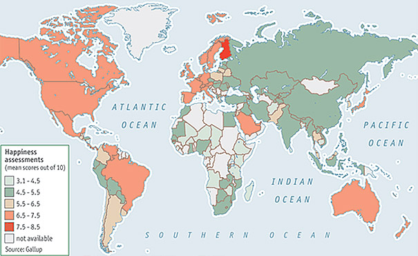


  • This map represents the levels of happiness that people from different countries have. The Gallup researchers found evidence of what many have long suspected: money does buy happiness–at least a certain kind of it. The people from countries with redish colors are happier than the ones from countries with greenish colors. The source is http://www.boredpanda.com/maps-they-didnt-teach-you-in-school/, which is the URL of a blog named Bored Panda. This blog shows a lot of interesting maps people do not normally see in schools. As shown, the most happy country is located in Europe, but the country is not specifically identified from the source, but I guess it is Finland. People from developing countries, such as Russia, China and India, are less happy. Meanwhile, people from developed countries are happier. For example, United States and Canada. I find this map interesting because it provides connections between happiness and countries' economic conditions, and it also demonstrates how emotional satisfaction differs from countries to countries.